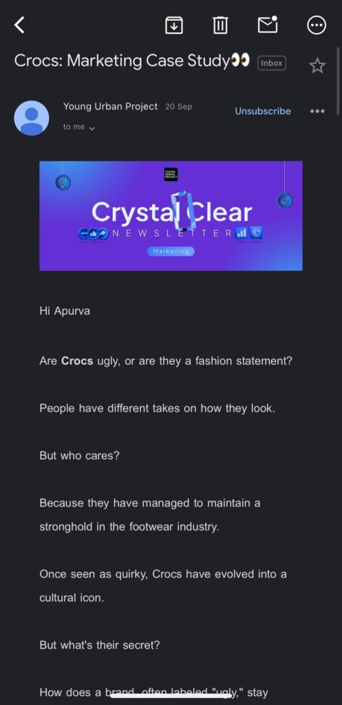
It’s Monday morning, and your inbox is overflowing. Amid the digital chaos, one email catches your attention. It’s visually appealing, easy to read, and flows so seamlessly that you actually enjoy consuming the content. What made this email stand out? It’s the email newsletter format.
Table of Contents
A well-structured email newsletter isn’t just about fancy graphics or clever subject lines—it’s about creating an experience for your reader. So what’s the formula for a perfect newsletter? How do you craft one that stands out in the crowded inbox?
In this guide, we’ll not only look at the anatomy of a well-structured email newsletter format but also give you actionable tips to optimize your campaigns for better engagement, conversions, and retention. Let’s dive in.
Why Does Email Newsletter Format Matter?
Think about your typical workday: Your inbox is flooded with emails, and you’ve got just seconds to determine which ones are worth opening. The reality is that your newsletter is competing with dozens, if not hundreds, of others.
So, how do you ensure that your newsletter makes the cut? The answer lies in format. The way you structure your newsletter plays a pivotal role in whether your audience even opens it, let alone reads it all the way through.
- A great format grabs attention right away.
- A well-organized layout guides the reader through your content seamlessly.
- A clear CTA drives action, ensuring that readers take the next step.
Without a solid structure, even the most brilliant content can fall flat. The right email newsletter format creates a smooth user experience, ensuring your message is received as intended—and acted upon.
Anatomy of a Perfect Email Newsletter Format
Creating a killer email newsletter starts with understanding the basic components that go into it. Let’s break down each element to help you fine-tune your design and content.
1. Subject Line: First Impression
Think of the subject line as the movie trailer for your newsletter. It has to grab attention quickly, teasing what’s inside but not giving it all away. The subject line often determines whether your email gets opened or discarded in a split second.
Tips for a Great Subject Line:
- Keep it short and intriguing: Ideally, you want to keep it between 40-50 characters. Too long, and your reader won’t see the full text.
- Use personalization: Including the recipient’s name or referencing their previous interactions can make the email feel more relevant and increase open rates.
- Make it actionable: Phrases like “Learn How to” or “Discover the Secret to” can create curiosity and encourage clicks.
- Create urgency: “Limited Time Offer” or “Act Now” can make people feel like they need to read your email immediately.
Example Subject Line:
“John, here’s the secret to unlocking higher sales this month.”
2. Preheader Text: The Sneak Peek
After the subject line, the preheader text comes next. This text appears right next to or below the subject line and offers a little more context. Think of it as a preview of what’s inside, reinforcing the subject line.
How to Craft an Effective Preheader:
- Make sure it’s aligned with the subject line. They should complement each other and provide a clear next step.
- Keep it under 100 characters—remember, it’s a preview, not a full description.
- This text is valuable real estate—use it to add more context or make a compelling case for opening the email.
Example Preheader Text:
“Learn the strategies that helped us triple our conversions in just 3 months.”
3. The Header: Visual Impact
Your email’s header is the first thing a recipient sees after opening it. This section sets the tone for the rest of the email and needs to make an immediate impact. Ideally, the header should include your logo and be visually engaging, without overwhelming the reader.
Best Practices for Headers:
- Branding: Ensure your logo is visible, as it creates brand recognition.
- Colors and Imagery: Use colors that align with your brand but make sure they’re not too aggressive. Your email header should look clean and polished.
- Navigation Links: If you have other resources, consider adding navigation links in the header for easy access to your site or blog.

4. The Body: Keep It Digestible
When it comes to the body of your email, there’s one major rule: Keep it simple. We live in an age where attention spans are short. So, bombarding the reader with paragraphs of text is a surefire way to lose them. Here’s how to structure the body of your email for maximum readability:
- Short, Scannable Sections: Use short paragraphs, subheadings, and bullet points. People skim emails, so make sure the most important information is easy to find.
- Keep it Value-First: Deliver the value in the first few lines. Don’t make readers scroll down to find out what the email is about.
- Make It Personal: Tailor the content to your audience. Use language that resonates with them and solves a problem.
- Visuals Are Key: Whether it’s images, GIFs, or infographics, visuals help break up text and make your email more engaging. But don’t go overboard—too many images can slow down load times or clutter the layout.
5. Call-to-Action (CTA)
This is where the magic happens. Without a clear CTA, your newsletter is nothing more than a missed opportunity. Whether you want the reader to click a link, download a resource, or sign up for a service, the CTA is the driving force behind your email’s success.
How to Craft a Compelling CTA:
- Be Specific: Use action words that are direct and to the point. “Download Now,” “Shop Today,” and “Start Your Free Trial” are great examples.
- Make It Stand Out: Your CTA button should be prominently placed and have a color that contrasts well with the rest of the design.
- Repetition: Include a CTA at both the top and bottom of your email so the reader doesn’t have to scroll to find it.
Example CTA:
“Get Started with Our Free Ebook Now.”

What Makes a Winning Email Newsletter Format?
Now that we’ve covered the basic structure of a newsletter, let’s explore how you can refine it for maximum impact. The devil’s in the details, and there are several advanced tactics that can take your email to the next level.
1. The 80/20 Rule of Content
Your email newsletter should focus 80% on delivering valuable content, and only 20% on promoting your products or services. Why? Because if your emails are overly promotional, your readers will tune you out. Instead, make your emails informative, entertaining, and engaging first, and use a small portion of it to make your sales pitch.
2. Mobile-First Design: The New Standard
Did you know that more than 70% of email opens occur on mobile devices? If your email isn’t mobile-friendly, you’re losing out on a massive audience. Mobile-first design is no longer optional—it’s essential.
Mobile-First Best Practices:
- Single-Column Layouts: Avoid complex multi-column layouts, which can look cramped on smaller screens.
- Readable Fonts: Use fonts between 14-16px for the body text. Too small, and people will abandon your email.
- Tap-Friendly Buttons: Ensure that buttons are large enough for fingers to click easily.
3. Personalization Beyond First Names
Gone are the days when simply addressing the recipient by their first name was enough. To truly connect with your audience, you need to personalize your emails based on their behavior, preferences, and past interactions.
Advanced Personalization Tactics:
- Behavioral Triggers: Send personalized emails based on actions such as previous purchases, abandoned cart items, or specific interactions with your website.
- Location-Based Content: Tailor your content to a reader’s geographical location. This works great for event promotions or localized offers.
Common Email Newsletter Format Mistakes (And How to Avoid Them)
1. Overloading with Content
While it may be tempting to include everything, less is often more. Emails overloaded with content can overwhelm the reader, making them more likely to unsubscribe.
- Keep sections concise and only include what’s most relevant.
- Link to longer-form content if necessary.
2. Ignoring White Space
White space isn’t wasted space—it’s essential for readability. Without adequate white space, your email looks cluttered and uninviting.
- Ensure that there’s enough padding around text and images.
- Keep margins clean and consistent across sections.
3. Skipping A/B Testing
You can never know what works unless you test it. A/B testing your emails—whether it’s the subject line, CTA, or content—helps you understand what resonates best with your audience.
- Test everything: subject lines, designs, CTA buttons, and sending times.
Top Email Newsletter Formats You Can Steal
Looking for some inspiration? Here are a few popular email newsletter formats that are tried and tested:
1. The Curated Newsletter
Perfect for sharing valuable resources and insights without being overly promotional.
Example:
- Header: “Top Digital Marketing News of the Week”
- Body: Include 3-5 key articles or resources, with a short description for each.
2. The Storytelling Newsletter
Tell a compelling story that engages the reader, followed by a CTA to learn more or buy.
Example:
- Header: “How Our Product Saved X Business $100K”
- Body: Share the story in narrative format, leading the CTA to learn more.
Conclusion
Your email newsletter is your chance to connect with your audience on a deeper level. By optimizing your email format, you can dramatically improve engagement and conversions, leading to better ROI for your business. So, take the time to perfect your email structure and watch your open rates, click-through rates, and overall success soar.

