Are you tired of looking at plain numbers in your Power BI reports? Do you wish important trends would just jump off the screen? This is exactly what conditional formatting in Power BI helps you do. It turns ordinary data tables into easy-to-understand visual displays that show what really matters. Whether you track sales numbers, check inventory, or look at customer data, learning conditional formatting will make your Power BI reports much better.
Table of Contents
This guide covers everything about conditional formatting in Power BI – from basic color rules to more complex formatting tricks. By the time you finish reading, you’ll know how to create reports that don’t just show data but tell clear stories with it.
What is Conditional Formatting?
Conditional formatting in Power BI is a visualization technique that changes how data appears based on specific conditions or rules you define. Instead of displaying all data in the same way, conditional formatting automatically applies different colors, icons, or formatting styles to cells, rows, or columns that meet certain criteria. For example, you can highlight all sales figures below target in red, use data bars to show relative performance, or add icons to indicate status levels.
Why is Conditional Formatting Important in Power BI?
Conditional formatting is crucial in Power BI because it helps users quickly identify patterns, trends, and outliers without having to analyze raw numbers. It transforms complex datasets into visual insights that can be understood at a glance, making your reports more effective and actionable. Good visual cues guide the audience’s attention to what truly matters in your data story.
Key Benefits of Using Conditional Formatting
- Improved data visualization – Makes important information stand out immediately
- Faster decision-making – Helps users identify issues or opportunities quickly
- Better data storytelling – Creates visual narratives that are easy to follow
- Enhanced user experience – Makes reports more engaging and interactive
- Clearer data comparisons – Shows relationships between values more effectively
- Simplified complex data – Reduces cognitive load when analyzing large datasets
Also Read: Core Components of Power BI
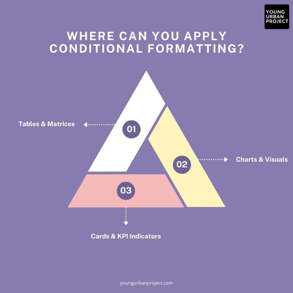
Where Can You Apply Conditional Formatting?

1. Tables & Matrices
Tables and matrices are the most common places to apply conditional formatting in Power BI. You can format individual cells based on their values, compare values across rows or columns, or even format entire rows based on specific conditions. This is particularly useful for financial reports, sales data, and performance metrics where you need to highlight variations against targets or thresholds.
For example, in a sales table, you can use color scales to show high-performing products in green and underperforming ones in red, or add data bars to visually compare values within a column.
2. Charts & Visuals
While not as extensive as table formatting, many Power BI visuals support conditional formatting options. Bar and column charts can display different colors based on values, and some custom visuals offer advanced formatting capabilities. This helps emphasize specific data points or categories within your visualizations.
You can color bars in a chart based on whether they’re above or below target, or change the colors of data points in a scatter plot to highlight different segments or performance levels.
3. Cards & KPI Indicators
Cards and KPI visuals can be conditionally formatted to serve as clear status indicators. You can set up rules to change the color of a KPI based on performance thresholds or use icons to provide visual status indicators.
For instance, a sales target card could display green when targets are met, yellow when they’re close, and red when they’re significantly below expectations, giving viewers immediate insight into performance without requiring them to interpret the raw numbers.
Also Read: Power BI vs Excel: Key Differences & Dashboard Comparison
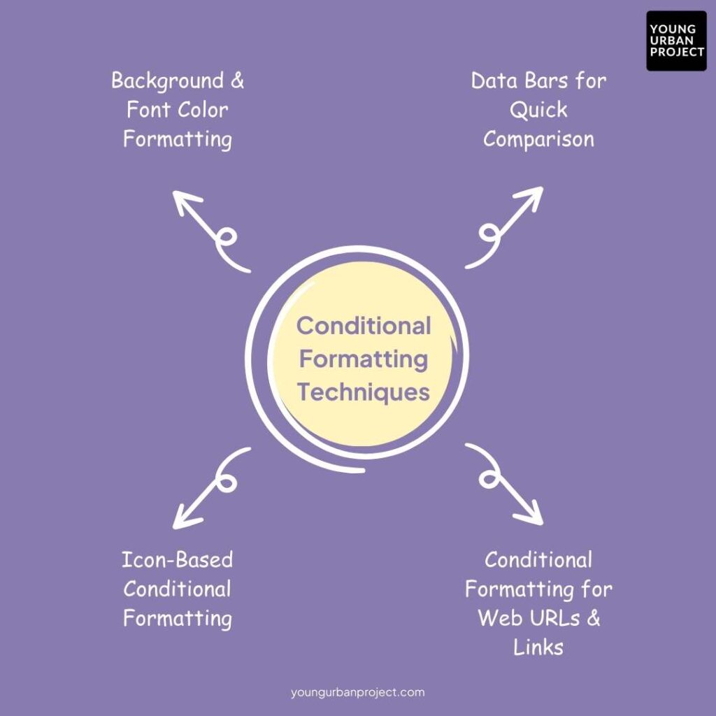
Essential Conditional Formatting Techniques

1. Background & Font Color Formatting
Background and font color formatting is one of the most useful ways to make important data stand out in Power BI. You can apply color scales that change gradually based on values, making it easy to spot high or low numbers at a glance. For example, sales figures could range from red (low) to yellow (average) to green (high).
How to Apply Color Scales Based on Values:
- Click on your table or matrix visual
- Select the column you want to format
- Click the “Conditional formatting” button in the formatting pane
- Choose “Background color” or “Font color”
- Select a color scale and set your minimum and maximum values
Custom Color Rules for Categories:
- Use the “Rules” option instead of color scales
- Create specific rules like “If value > 10,000, color is green”
- Add multiple rules to handle different conditions
- Choose custom colors to match your report theme
2. Data Bars for Quick Comparison
Data bars add small horizontal bars to your table cells, making it super easy to compare values across rows. The length of each bar shows the relative size of the value, giving you a mini chart right in your table.
Using Data Bars for Numeric Columns:
- Select your table or matrix in Power BI
- Choose the column you want to add data bars to
- Click “Conditional formatting” and select “Data bars”
- Set your minimum and maximum values (or use automatic)
- Check the preview to make sure it looks good
Customizing Data Bar Colors and Directions:
- Change the bar color to match your report theme
- Set the direction (left-to-right or right-to-left)
- Choose to show the bar only or bar and data
- Adjust transparency to make sure numbers remain readable
3. Icon-Based Conditional Formatting
Icons add small visual indicators next to your numbers, showing status or performance at a glance. Power BI includes arrows, flags, ratings and other icons that help users quickly understand what’s good, bad, or neutral.
Applying Built-in Icons for Performance Indicators:
- Select your table or matrix visual
- Choose the column for icon formatting
- Click “Conditional formatting” and select “Icons”
- Pick an icon set (arrows, flags, ratings)
- Set your rules for when each icon should appear
Using Custom Icons for Enhanced Visualization:
- Choose from various icon sets in Power BI
- Set up rules based on percentages or fixed values
- Combine icons with other formatting for more impact
- Consider your audience when choosing icons – use familiar symbols
4. Conditional Formatting for Web URLs & Links
You can turn data in your tables into clickable links, making your reports more interactive. This is perfect for connecting reports to external resources or websites based on the data.
Creating Clickable Links with Formatting:
- Make sure your column contains valid URLs
- Select the column in your table
- Click “Conditional formatting” and choose “URL”
- Set display text options (show URL or custom text)
- Test your links to make sure they work correctly
Use Cases: Linking External Reports, Dashboards, or Resources:
- Link to product pages from product ID numbers
- Connect customer names to CRM records
- Create links to detailed reports for specific departments
- Add links to supporting documents or policy references
Also Read: What are Bookmarks in Power Bi
Advanced Conditional Formatting Techniques
1. Conditional Formatting Using DAX Measures
DAX measures let you create custom calculations for conditional formatting. Instead of using the built-in options, you can write formulas that handle complex business rules. This gives you much more control over how your data is formatted. For example, you could highlight values that are both below target and trending downward, or format based on year-over-year comparisons.
Writing DAX Expressions for Custom Formatting:
- Create a new measure using DAX
- Write logic that returns the color or format you want
- Apply this measure to your visual’s conditional formatting
- Test with different data scenarios
2. Rule-Based Formatting for Dynamic Visuals
Multiple formatting rules can work together to create dynamic visuals that change based on data or user input. You can set up a series of rules that apply different formats depending on various conditions. This approach works well when simple color scales aren’t enough to show complex relationships in your data.
Applying Multi-Rule Conditional Formatting:
- Set up rules in priority order (first matching rule applies)
- Create clear visual differences between rule outcomes
- Use slicers or filters to see how formatting changes
- Keep rule logic simple enough for others to understand
3. Conditional Formatting for Entire Rows & Columns
Sometimes you need to highlight entire rows or multiple columns based on a single value. This helps users follow related data across the table. For example, you might want to highlight all information for high-value customers or flag entire product lines that are underperforming.
How to Apply Conditional Formatting to a Whole Row:
- Create a measure that determines the row condition
- Apply formatting to each column using that measure
- Keep the formatting consistent across columns
- Consider using subtle formatting to avoid visual overload
Common Conditional Formatting Issues & Fixes
1. Troubleshooting: Why Conditional Formatting Might Not Work?
Sometimes conditional formatting doesn’t work as expected in Power BI. This can happen when data types don’t match, when measures are calculated incorrectly, or when formatting rules conflict with each other. If your conditional formatting isn’t showing up, first check that your column data types match what you’re trying to format. Also make sure your minimum and maximum values make sense for your data range.
Common Errors and How to Fix Them:
- Wrong data type: Make sure text columns aren’t being treated as numbers or dates
- Rule conflicts: When multiple rules apply, only the first matching rule works
- Blank values: Conditional formatting may not work on empty cells
- Incorrect measures: Check that your DAX measures return the expected values
- Visual limitations: Some visuals have limited conditional formatting options
Debugging Conditional Formatting in Power BI:
- Test with simple rules first to confirm basic functionality
- Check your data for unexpected values or formats
- Try applying formatting to a different column to test if the issue is column-specific
- Create a small test table with known values to check your formatting logic
- Remember that some visuals have more formatting options than others
2. Copying & Removing Conditional Formatting
Managing conditional formatting across multiple visuals can be tricky in Power BI. If you need to use the same formatting in multiple places, you’ll need to recreate the rules for each visual. Knowing how to remove formatting is also important when you need to start over or clean up your report.
Can You Copy Conditional Formatting Rules in Power BI?
- Power BI doesn’t let you directly copy formatting between visuals
- You need to recreate rules manually for each table or chart
- Take screenshots of settings to remember complex rules
- Consider using a standard set of colors and thresholds across your report
- For complex rules, write down the steps to recreate them
How to Remove Conditional Formatting from Visuals:
- Select the visual with formatting you want to remove
- Go to the formatting pane and find the formatted field
- Click on “Conditional formatting” for that field
- Select the formatting type (like background color or data bars)
- Click “Remove formatting” to reset to default styling
- Repeat for each type of conditional formatting applied
Also Read: Power BI Heatmap: A Step-by-Step Guide
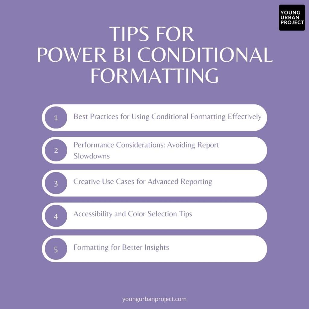
Pro Tips for Power BI Conditional Formatting

1. Best Practices for Using Conditional Formatting Effectively
Keep color schemes consistent throughout your report to help users understand what colors mean. Red should always indicate problems, while green should show success. Use formatting sparingly – too many colors and icons can overwhelm viewers and hide important insights. Focus on highlighting exceptions and important data points rather than formatting everything.
2. Performance Considerations: Avoiding Report Slowdowns
Complex conditional formatting rules, especially those using DAX measures, can slow down your reports. Test performance as you add formatting and simplify rules if needed. Try to use built-in formatting options before creating custom DAX measures. For large tables, consider formatting only the most important columns to keep performance strong.
3. Creative Use Cases for Advanced Reporting
Use conditional formatting to create simple gauges within tables by combining data bars with background colors. Highlight time-sensitive data like approaching deadlines or aging inventory with color scales. Apply icons to status fields to create mini dashboards within your tables. Use conditional formatting on headings to indicate overall section performance at a glance.
4. Accessibility and Color Selection Tips
Choose colors that work well for colorblind users by avoiding red/green combinations without another visual indicator. Include sufficient contrast between text and background colors to ensure readability. Consider using patterns or icons alongside colors to make your formatting accessible to all users. Test your reports with accessibility tools to verify they work for everyone.
5. Formatting for Better Insights
Apply conditional formatting based on business context, not just raw numbers. Format values compared to targets, industry benchmarks, or previous periods for meaningful insights. Use different formatting approaches for different audiences – executives might need simpler formatting than analysts. Adjust thresholds based on business cycles or seasonality when appropriate.
Enroll Now: Power BI Mastery Course
Conclusion
Conditional formatting in Power BI transforms ordinary reports into powerful visual tools that help users spot trends, identify outliers, and make better decisions. We’ve covered everything from basic color formatting to advanced DAX-based techniques that can handle complex business rules. By applying these skills to your own reports, you’ll create more engaging, insightful visualizations that help your audience understand data quickly.
The key to mastering conditional formatting is practice and experimentation. Start with simple formatting in your next report, then gradually add more advanced techniques as you become comfortable. Keep learning by exploring the Power BI community forums, watching tutorial videos, and studying reports created by others. Remember that good formatting should always serve your data story – making important information stand out while keeping your reports clean and professional.
FAQs: Conditional Formatting in Power BI
1. Can you use custom icons in conditional formatting?
Power BI offers several built-in icon sets for conditional formatting, but doesn’t support uploading custom icons. You’re limited to arrows, flags, ratings, and other standard icons in the formatting options. For truly custom icons, you would need to use other visualization techniques like custom visuals or images.
2. How to copy Power BI conditional formatting?
Power BI doesn’t provide a direct way to copy conditional formatting between visuals. You need to manually recreate each formatting rule on new visuals. Take screenshots of your settings or write down your rules to make recreation easier. For consistent formatting across reports, consider creating a template report.
3. What should you do if conditional formatting is not working?
First check your data types – make sure text isn’t being treated as numbers or dates. Verify your minimum and maximum values make sense for your data. Look for blank values that might affect formatting. Test with simpler rules to see if basic formatting works. Check for competing rules that might override each other.
4. Is it possible to conditionally format an entire row in Power BI?
Yes, but it requires applying the same conditional formatting to each column individually. Create a measure that determines the condition for highlighting rows, then apply this measure to format each column. This approach requires more setup but effectively creates row-based formatting for your table or matrix.

