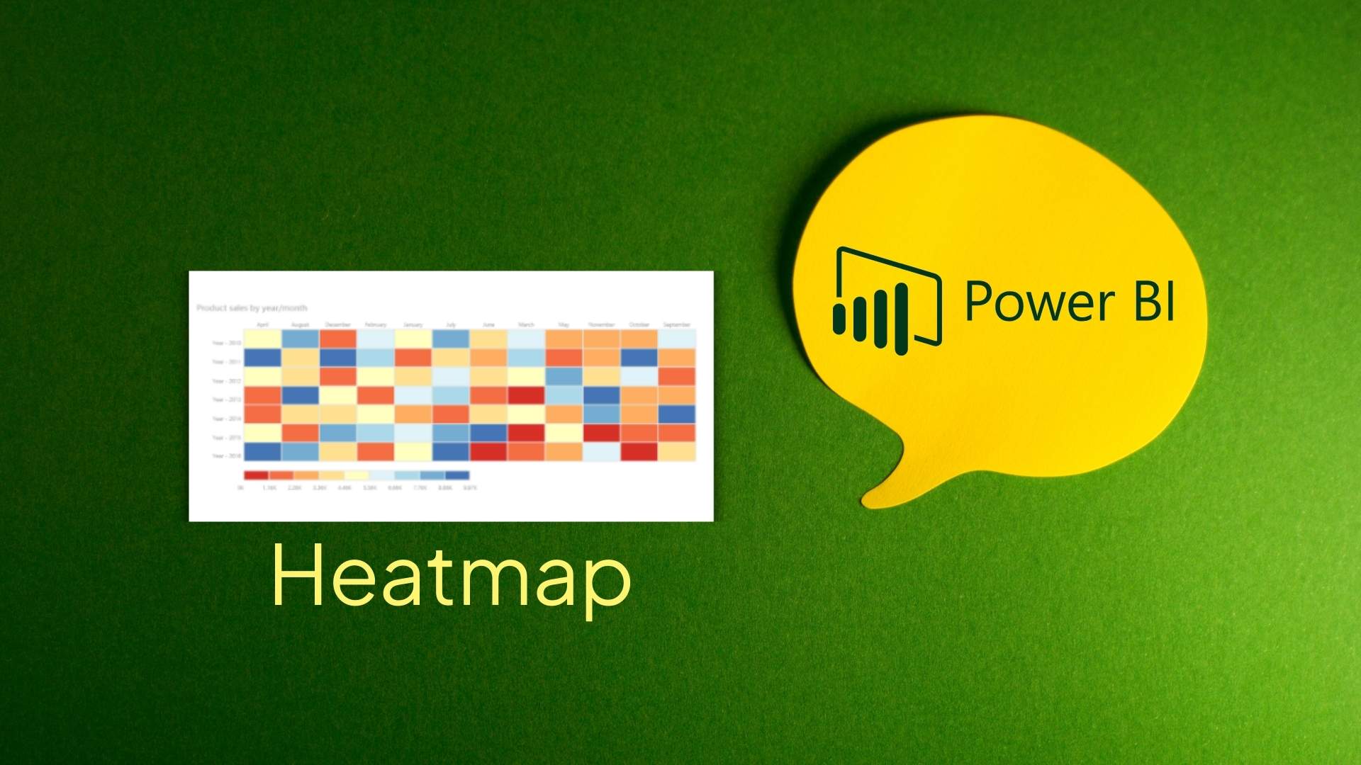
Does a spreadsheet full of numbers ever make your brain freeze? That feeling of data overload is precisely why heatmaps have become such a game-changer in business intelligence. When a regional sales manager couldn’t figure out why certain stores consistently underperformed, a simple Power BI heatmap revealed that sales plummeted during local sporting events—a pattern completely hidden within thousands of rows of data. In this guide, we’ll walk through everything you need to know about creating effective heatmaps in Power BI, from basic matrix formatting to advanced custom visuals. You’ll learn practical techniques to transform your overwhelming datasets into clear, actionable insights that can drive better business decisions.
Table of Contents
What is a Heatmap in Power BI?
A heatmap in Power BI is a visual tool that uses colors to show the relative values in your data. Think of it like a weather map that shows hot and cold areas, but for your business numbers. Darker or brighter colors usually mean higher values, while lighter colors show lower values.
Heatmaps help you see patterns in your data quickly without having to read through lots of numbers. They make it easy to:
- Spot trends that happen over time or across different categories
- Find unusual values that stand out from the rest
- See how values change between different groups
Businesses use heatmaps in many ways:
- Sales teams use them to see which products sell best in different regions
- HR departments track employee performance across teams
- Marketing teams check which days and times get the most website visitors
- Financial analysts look for spending patterns across departments
- Store managers compare store performance throughout the year
The best thing about heatmaps is that you can understand what’s happening in your data at a glance, without digging through spreadsheets or reports.
Also Read: Components of Power BI for Better Data Insights
Methods to Create a Power BI Heatmap
You can make heatmaps in Power BI in two main ways. Let’s look at each one.
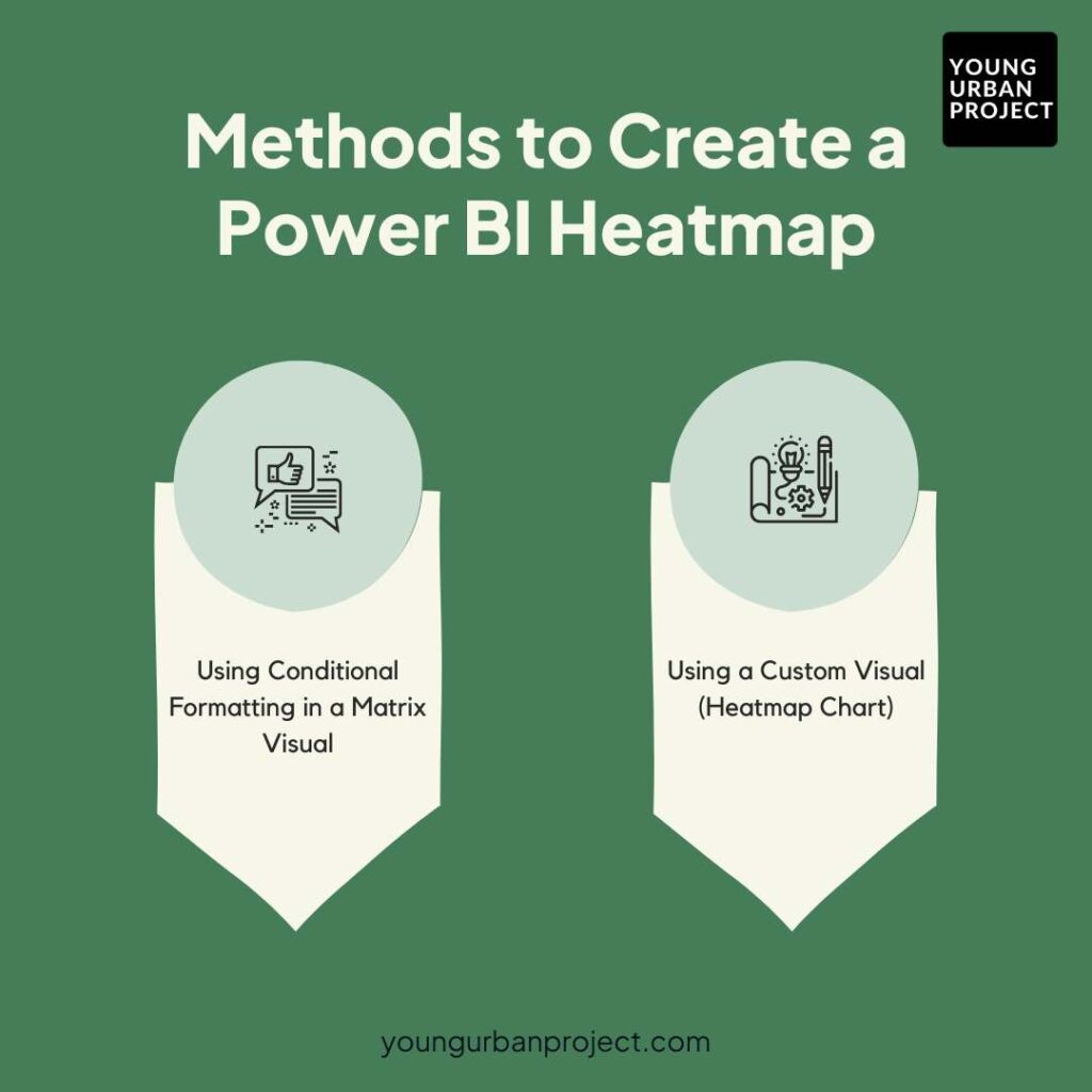
1. Using Conditional Formatting in a Matrix Visual
You don’t need fancy add-ons to make a good heatmap in Power BI. The basic matrix visual that comes with Power BI does the job well. This approach uses color shading to show high and low values in your data tables. The best part is that you already have this tool – no downloads needed. It works by applying color rules to your numbers, turning your regular tables into colorful heat maps. Many experts prefer this method because it’s quick to set up and works with any data you throw at it. Plus, you can easily change colors, adjust ranges, and format it exactly how you want without learning new tools.
2. Using a Custom Visual (Heatmap Chart)
Sometimes the built-in tools don’t quite fit what you need. That’s where custom heatmap visuals come in. These are special charts made just for creating heatmaps, available in the Power BI marketplace. Think of them as plugins that add new features to Power BI. These custom visuals often include extra options like different shapes, more color choices, or special tooltips that the regular matrix visual doesn’t offer. While they take a bit more work to set up at first, they can create more eye-catching and specialized heatmaps. For data that needs a specific look or extra features, these custom charts can be worth the extra effort.
Step-by-Step Guide: Creating a Heatmap in Power BI
1. Using Conditional Formatting in a Matrix Visual
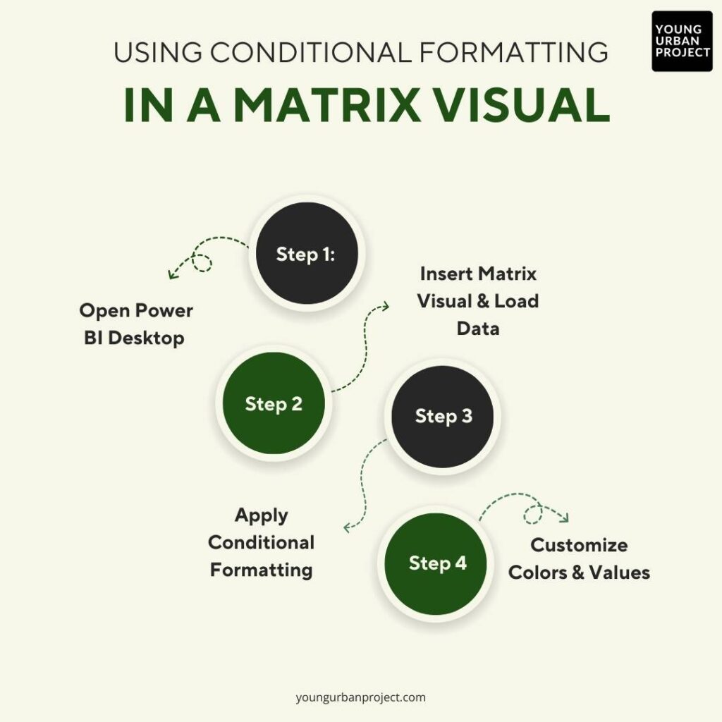
The matrix visual is already part of Power BI, so this is the easiest way to create a heatmap.
Step 1: Open Power BI Desktop
Open the Power BI Desktop program on your computer. If you don’t have it yet, you can download it for free from Microsoft’s website.
Step 2: Insert a Matrix Visual and load the dataset
- Click on the Matrix icon in the Visualizations panel
- Drag the fields you want to analyze to the Rows and Columns areas
- Drag your measure (the values you want to show with colors) to the Values area
For example, if you want to see sales by product and region, put Product in Rows, Region in Columns, and Sales in Values.
Step 3: Apply Conditional Formatting for a heatmap effect
This is where the magic happens:
- Select the matrix visual by clicking on it.
- Click the dropdown arrow next to the field in Values
- Choose “Conditional formatting” and then “Background color”
- In the window that opens, set:
- Minimum and maximum values (or leave them as auto)
- Choose colors for minimum, center, and maximum values
- Click “OK” to apply
Your matrix will now show colors based on the values in each cell.
Step 4: Customize colors and values for better visualization
Make your heatmap easier to understand:
- Choose colors that make sense for your data (red for high risk, green for good performance)
- Adjust the minimum and maximum values if needed
- Add data labels if you want to see both colors and numbers
- Resize columns to fit your data better
2. Using a Custom Visual (Heatmap Chart)
For more options, you can use a special heatmap visual from the marketplace.
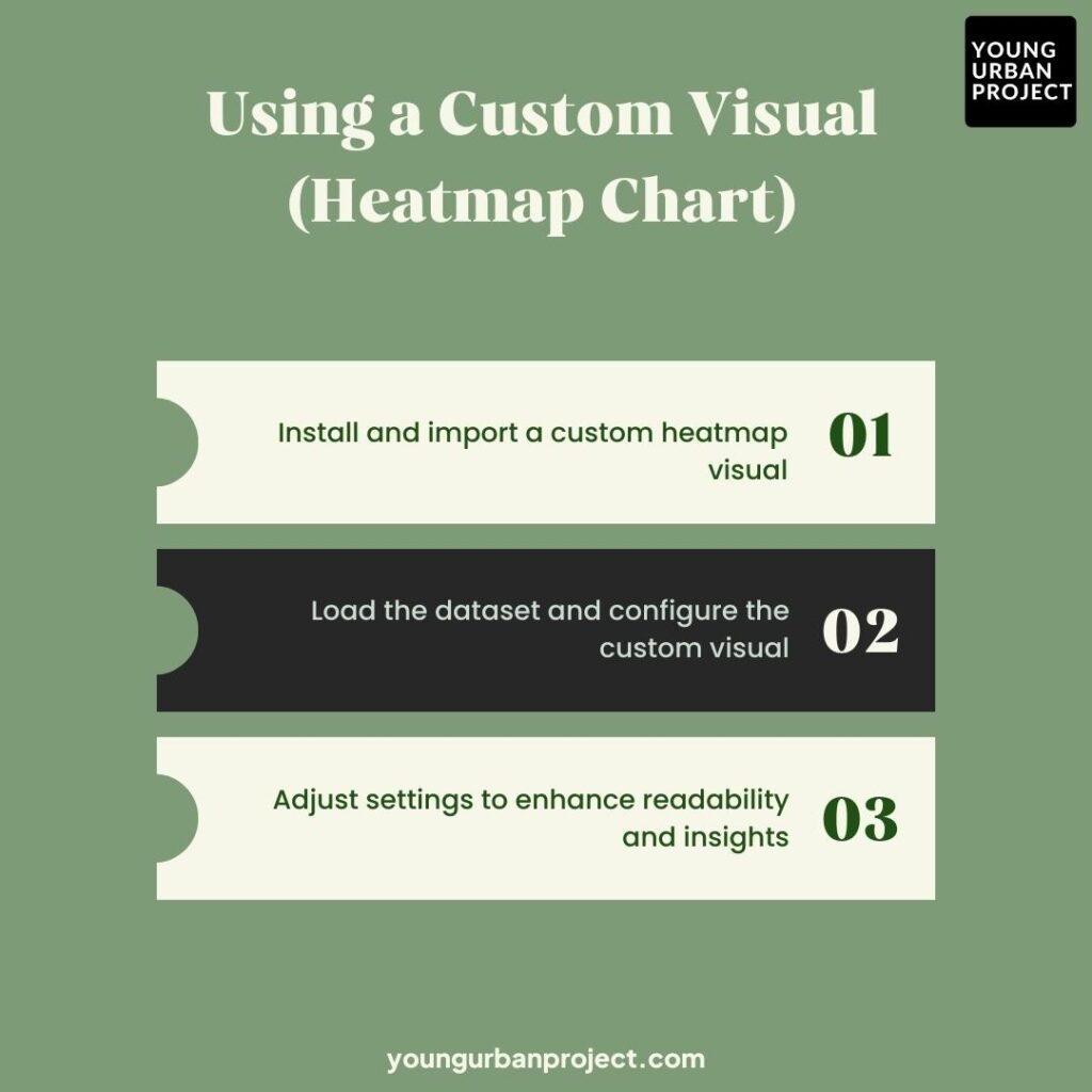
Step 1: Install and import a custom heatmap visual
- In Power BI Desktop, click on the three dots (…) in the Visualizations panel
- Click “Get more visuals” to open the Power BI Marketplace
- Search for “heatmap” and find one you like (Table Heatmap is popular)
- Click on it and then click “Add” to install
- The heatmap icon will now appear in your Visualizations panel
Step 2: Load the dataset and configure the custom visual
- Click on the heatmap icon you just added
- Drag your category fields to the right areas (categories, series)
- Drag your measure (like sales amount) to the Values field
The setup is a bit different depending on which custom visual you choose, but most will need at least one category field and one value field.
Step 3: Adjust settings to enhance readability and insights
Custom visuals usually have more setting options:
- Change the color scheme from the Format panel
- Set value ranges manually if needed
- Add labels, titles, and legends
- Try different gradient options (some have more than 3 colors)
- Adjust cell size and spacing
Also Read: Power BI vs Excel: Key Differences & Dashboard Comparison Guide
Tips for Better Heatmaps:
- Choose the right colors: Use colors that make sense for your data (red for negative, green for positive; or blues for cold values, reds for hot values)
- Don’t use too many colors: Stick to 2-3 color gradients for clarity
- Scale appropriately: Sometimes using percentages works better than raw numbers
- Add context: Include titles and legends explaining what the colors mean
- Consider colorblind users: Avoid red-green combinations if possible
Common Mistakes to Avoid:
- Using too many categories: Heatmaps become hard to read with too many rows and columns
- Poor color choices: Choosing colors that don’t show contrast well
- Misleading scales: Setting minimum and maximum values that hide important variations
- Forgetting legends: Not explaining what the colors represent
- Overloading with information: Adding too many data labels on top of the colors
- Not sorting data: Random ordering makes patterns harder to spot
- Using heatmaps for the wrong data: Some data is better shown with other chart types
Also Read: What are Bookmarks in Power Bi- Types and Examples
Why Are Heatmaps Useful in Power BI?
Heatmaps are particularly useful when you need to make sense of large data tables quickly. Unlike bar charts or line graphs that might get messy with too many data points, heatmaps can handle lots of information at once.
Advantages Over Other Visualizations
The biggest strength of heatmaps is how they use color to tell a story. Your brain can spot color patterns much faster than it can compare numbers or bar heights. This means you can see trends across two dimensions at once.
Other benefits include:
- They work well with dense tables that would be cluttered as charts
- They show patterns that might be invisible in raw numbers
- They make outliers stand out instantly
- They use space efficiently compared to multiple charts
Business Applications
Sales Analysis
Heatmaps make it easy to see which products sell best in which regions or during which months. A quick glance shows you hot spots where sales are booming and cold areas that need attention.
Customer Behavior
Track when customers visit your website or store throughout the day and week. The heat pattern instantly shows peak times and quiet periods, helping with staffing decisions.
Financial Reporting
Finance teams use heatmaps to spot unusual spending patterns or track budget variances across departments. Red cells quickly flag areas that need investigation.
Production Monitoring
Manufacturing plants use heatmaps to track defect rates across production lines and shifts, making it easy to spot problem areas.
Better Decision-Making
Heatmaps speed up decisions because they turn complex data into simple visual signals. When a manager sees bright red cells in certain regions, they know immediately where to focus.
The color-coding works like an early warning system. Problems that might hide in spreadsheets become obvious on a heatmap, letting teams respond faster.
Heatmaps also help with fairness in decision-making. Everyone sees the same color pattern, reducing the chance that different people will interpret the data differently.
Perhaps most importantly, heatmaps make data accessible to everyone, not just analysts. This means more people can use data in their decisions, creating a more data-driven company culture.
Best Practices for Using Power BI Heatmaps
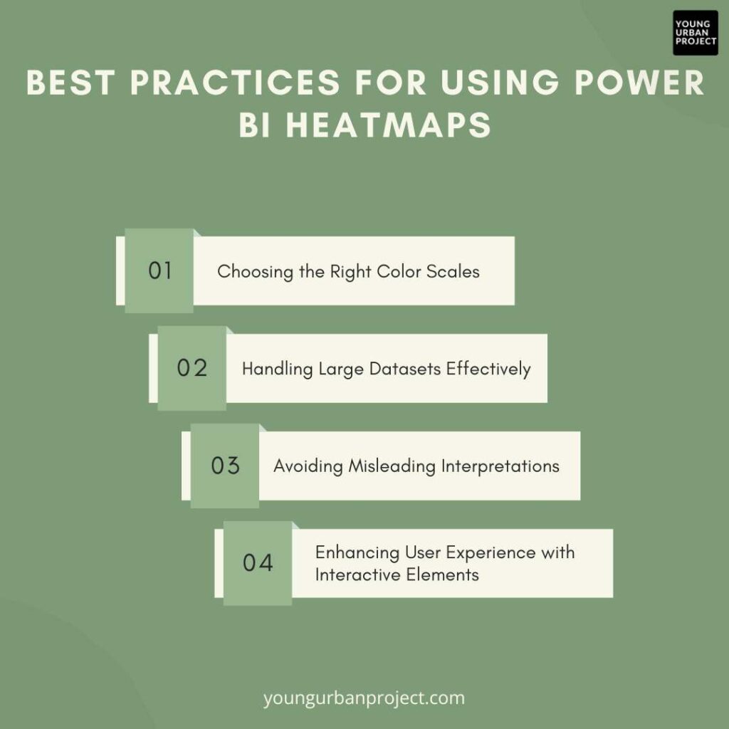
1. Choosing the Right Color Scales
Colors make or break your heatmap. For data with a natural middle (like profit/loss), use two colors with white in the middle – blue for positive, red for negative works well. For data that just goes from low to high, stick with one color in different shades. Always think about colorblind users – avoid red-green combinations when possible. Test your colors with colleagues to make sure the important patterns stand out clearly.
2. Handling Large Datasets Effectively
Big datasets can turn heatmaps into confusing messes. If you have too many rows or columns, group similar items together or show only the top items that matter most. Add filters so users can focus on what they care about. For really big datasets, use hierarchies so people can drill from big categories down to details. Consider using percentage changes instead of raw numbers to make patterns clearer when dealing with widely different values.
3. Avoiding Misleading Interpretations
Always include a legend showing what each color means. Be careful with your minimum and maximum values – automatic scaling can sometimes make small differences look huge. Consider whether you need fixed scales to show true context. Don’t let colors replace actual numbers completely – add labels to important cells. Make sure your title clearly explains what the heatmap shows. Remember that correlation isn’t causation, even when a pattern looks obvious on your colorful display.
4. Enhancing User Experience with Interactive Elements
Make your heatmaps more useful with tooltips that show exact values when users hover over cells. Add buttons that let people switch between different views of the same data. Create drill-through actions so users can click on interesting areas to see more details. Consider adding simple controls that change what measurement the heatmap displays. Keep your interactive features simple and clearly labeled – fancy features that nobody understands just get in the way.
Alternatives to Heatmaps in Power BI
1. Tree Maps
Tree maps use rectangles sized by one measure and colored by another. They work great for showing both the size and performance of categories at once. While heatmaps focus on the intersection of two dimensions, tree maps excel at showing hierarchical data. They’re perfect when you need to see both the big picture and how individual parts contribute to the whole.
2. Scatter Plots
Scatter plots place dots based on two different measures, showing how they relate to each other. You can add a third dimension by changing dot size or color. They’re best for finding correlations and outliers in your data. Unlike heatmaps, scatter plots work well when you need to see exact data points rather than general patterns across categories.
3. Bar Charts
Bar charts use length to compare values across categories. They’re simple but powerful for comparing specific items. You can use clustered or stacked versions to show multiple dimensions. While not as compact as heatmaps, bar charts are easier for most people to read exact values and make precise comparisons between specific items.
4. Tables with Icons
Sometimes a simple table with colored icons or data bars works better than a full heatmap. You get both the exact numbers and visual cues in one view. This approach combines the familiarity of tables with some visual elements, making it easier for users who are uncomfortable with more abstract visualizations.
When to use a heatmap versus other visuals
Choose a heatmap when you need to spot patterns across two dimensions with lots of data points. Heatmaps shine when you’re looking for hotspots, trends, or outliers in tables with many rows and columns. They work best when the pattern matters more than exact values.
Switch to other visuals when your needs change. Use bar charts when comparing specific items is more important than seeing the overall pattern. Pick scatter plots when relationships between measures matter most. Go with tree maps when showing both hierarchy and performance is crucial. And stick with tables when users need precise numbers alongside visual cues.
The key question to ask: do you need to see patterns across categories, or make specific comparisons between items? Heatmaps excel at the former, while other charts may work better for the latter.
Enroll Now: Power BI Mastery Course
Conclusion
Heatmaps in Power BI make it easier to understand complex data at a glance. By using colors to represent values, they help you quickly spot patterns that might be missed in regular tables or charts. We’ve covered how to create heatmaps using both matrix visuals and custom visuals, along with tips for making them more effective.
Remember to keep your color choices simple and meaningful – red for high values and blue for low values works well in most cases. Don’t overcomplicate your heatmaps with too much information. Focus on the story you want your data to tell.
Whether you’re analyzing sales across different regions, looking at website traffic throughout the day, or tracking employee performance, heatmaps can give you insights faster than scanning through numbers. They’re especially useful when presenting to people who aren’t data experts, as the visual patterns are easy for everyone to understand.
Now you have the knowledge to add powerful heatmap visualizations to your Power BI reports. This will help you and your team make better decisions based on clear visual data.
FAQs: Power BI Heatmaps
1. What insights can a heatmap provide?
Heatmaps quickly show you where values are high or low across two dimensions. They help spot seasonal trends, regional differences, and outliers at a glance. You can see patterns like which products sell best in which regions, which times have the highest website traffic, or which departments have budget issues. They’re especially good at revealing hidden patterns you might miss in tables of numbers.
2. How do you turn data into a heatmap in Power BI?
The easiest way is using matrix visuals with conditional formatting. Create a matrix with your categories on rows and columns. Add your measure to values. Then apply conditional formatting by clicking the format icon, finding “Conditional formatting,” and selecting “Background color.” Another option is downloading custom heatmap visuals from the marketplace and configuring them with your specific data fields.
3. Can Excel generate a heatmap?
Yes, Excel can make basic heatmaps using conditional formatting. Mark the data range, go to Conditional Formatting, and opt for Color Scales. This applies color gradients to your cells based on their values. Power BI offers more interactive features and customization options, but Excel works for simple cases when you don’t need the full power of BI tools.
4. Are heatmaps worth using in business intelligence?
Absolutely. Heatmaps quickly turn complex data tables into visual patterns that anyone can understand. They save time by highlighting important areas that need attention without requiring people to analyze rows of numbers. For monitoring performance across products, regions, or time periods, few visuals can pack as much information into such a compact, easy-to-scan format.
5. What are the key features that make Power BI suitable for heatmaps?
Power BI’s conditional formatting options let you create heatmaps easily without special add-ons. The interactive filters and slicers help users explore different views of the data. Cross-filtering connects heatmaps with other visuals on your dashboard. Power BI also handles large datasets smoothly and updates automatically when data changes. Plus, custom visuals from the marketplace add extra heatmap options.
6. What is the difference between a heatmap and a tree map in Power BI?
Heatmaps show values at the intersection of two dimensions using color intensity in a grid layout. Tree maps use rectangle size for one measure and color for another in a nested layout. Heatmaps work better for comparing across two categories (like products by month), while tree maps excel at showing hierarchical data (like sales by region, then by store) and the relative size of each category.
7. What are the best alternatives to heatmaps in Power BI?
Use a heatmap when comparing values across two categories with many data points. They’re perfect when the pattern matters more than exact values, like finding which regions have sales spikes during certain months. Choose heatmaps when dealing with large tables that would be cluttered as multiple charts. They’re also great for monitoring dashboards where color patterns can quickly signal problems needing attention.
8. When should you use a heatmap instead of other visualizations?
Use a heatmap when comparing values across two categories with many data points. They’re perfect when the pattern matters more than exact values, like finding which regions have sales spikes during certain months. Choose heatmaps when dealing with large tables that would be cluttered as multiple charts. They’re also great for monitoring dashboards where color patterns can quickly signal problems needing attention.

