Your cart is currently empty!
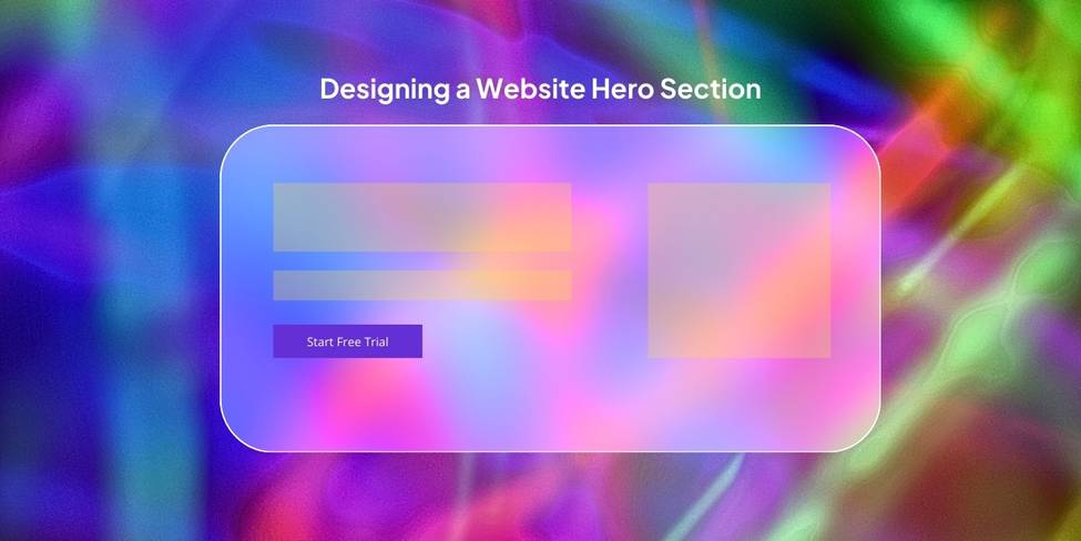
What is Hero Section of a Website and How to Make it? Best Practices, Tips & Examples
The hero section is one of the most important elements of web design, often serving as the first impression for new and returning visitors. It’s the large, visually engaging area at the top of a webpage that communicates your primary message and sets the tone for the rest of the site. It is also sometimes called as “Above The Fold” or “Zero Scroll” or “header section”.
But what exactly makes a hero section so important, and how can you design one that truly stands out (and converts like crazy)?
Let’s get into the details, best practices, and examples to inspire your next website, landing page, or sales funnel design. Read till the end to get an in-depth understanding of every element of the hero section.
Table of Contents
What is a Hero Section and Why is it Called That?
A pertinent question, wouldn’t you say?
The hero section is the prominent visual area at the top of a webpage or a landing page. It’s generally the first thing that a visitor will lay their eyes on. It’s designed to capture attention immediately and convey the essence of your product or service. The term “hero” stems from its role as the hero of your web design—it takes center stage and draws the visitor’s eye to the most important content (main character energy right there!).
Whether it’s a static image, a captivating video, or a bold headline paired with a call-to-action (CTA), the hero section’s goal is to make a strong first impression and guide the user towards exploring your site or landing page further.
A strong Hero section will ensure that visitors scroll further and get more information about your product or service. A weak Hero section will not be able to hook them, and lead them to bounce back. That wastes marketing efforts and budget.
Also Read: What is a Landing Page? Importance, Examples and Best Practices
The Anatomy of a Hero Section
A well-designed hero section consists of several key elements. Let’s break down the anatomy:
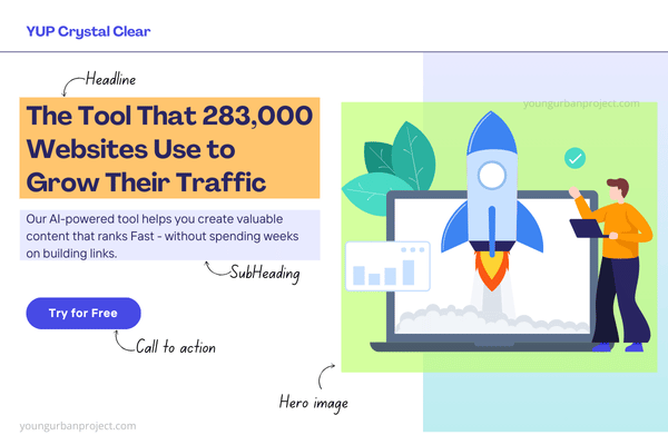
1. An Attention-Grabbing Headline
Your headline is the first thing people will read. It needs to instantly communicate your product or service’s value and persuade people to continue scrolling.
Writing strong headlines requires an in-depth understanding of persuasive copywriting.
Example: “The Tool That 283,000 Websites Use to Grow Their Traffic.”
It uses this template: The [Object] That [Social Proof] Use To [Desired Outcome] – This is just one of the hundreds of formulae that experts use.
Why it works: It’s clear, benefit-driven, and leverages existing users to create trust.
2. The Sub-Heading
The sub-heading provides additional context or expands on the headline, giving users a reason to stay engaged.
This is where you get specific and continue the story started by the headline.
Introduce the product and talk about how it adds value to the customer.
Example: “Our AI-powered tool helps you create valuable content that ranks Fast – without spending weeks on building links.”
Why it works: It’s specific and builds credibility.
3. A Hero Image or Hero Video
Visuals play a critical role in the hero section. Use high-quality images or videos that resonate with your target audience and align with your brand message.
This is where you show off your product in all its glory. The goal is to get as close to reality as possible.
You can avoid showing users random, fancy illustrations. Instead, show them your product. Or even better, your product in action.
4. A Call to Action (CTA)
The CTA button should be prominently displayed, guiding visitors toward the next step, whether it’s signing up, exploring products, or learning more.
Your CTA makes taking the next step easy.
Most buttons emphasize action: Sign Up, Start Trial etc.
However, you can try other options. Here are two more compelling CTA types.
- Call to value
Buttons that emphasize “value” over “action” tend to perform better. The idea is to fulfill the value that your headline has promised.
Example: “Start ranking my website on Google” or “Show me my heatmap”. - Objection handling
Adding a few words to your CTA to handle the user’s biggest objection to clicking (whatever is stopping them to take the action).
Example: “Start for Free. No CC Required”
5. Social Proof or Trust Signals
Incorporating elements like testimonials, awards, or logos of trusted brands builds credibility and encourages user engagement.
The truth is: People trust people who have used the product or service – even more than the brand’s marketing communication. This is why you can write things like:
- Trusted by 2000+ customers
- Used by 150+ brands
- 150000+ happy customers
How to Design a Great Hero Section – Best Practices
Designing an effective hero section requires a mix of creativity, strategy, and user-centric thinking. It can massively impact the consumer buying process. Here are some best practices:
1. Use High-Quality Images
Visuals are the cornerstone of a hero section. Invest in professional photography or high-resolution graphics to leave a lasting impression. If those are not possible, you have your AI image generation tools like: Canva’s Magic Studio (which uses LeonardoAI), Dall-E by OpenAI, Midjourney, and MetaAI.
2. Don’t Lose Sight of User Goals
Always design with the user in mind. Ensure the hero section aligns with their needs and expectations. If the Hero section is created for a sales page, focus on highlighting the product/service benefit and get visitors to take the conversion action (selling to customers).
3. Choose Your Words Carefully
This is where effective persuasive copywriting can help you. Craft concise, compelling copy that communicates your unique value proposition, while keeping them engaged, and building trust. Don’t write things that do not help the user go to the next step.
4. The Call-to-Action Button Should Be Visually Prominent
The CTA button should stand out with contrasting colors and actionable text. A lot of designers make the mistake of making the CTA either too small, or using colours that does not make it pop out.
Remember, this button takes people ahead in the buyer journey and if it is hard to spot, it is going to effect overall conversions.
5. Don’t Overuse Call-to-Action Buttons – Be Subtle
While it’s essential to have a clear CTA, avoid overwhelming users with too many buttons. There could be a scenario where you have to use 2 buttons (instead of one). These are Primary and Secondary CTAs.
Example: SAAS companies use this a lot where the more prominent (primary) CTA says “Start Free Trial” and the smaller (secondary) CTA says “Purchase now”. Note that both of them take users ahead – but the primary CTA is the one most people will choose, hence it needs to be more visible. And the secondary CTA allows users to skip the trial and go to a paid subscription directly. But not many people will do that directly, hence it is lower in visual hierarchy.
6. Be Mindful of Space – No Clutter
Simplicity is key. Avoid clutter and maintain a clean, organized layout.
Whitespace (or negative space) is a design principle that highlights the importance of having a clean, clutter-free canvas. It can help you focus user attention on the elements that truly matter.
7. Show Explicit or Implicit Benefits
Clearly state how your product or service benefits the user. Remember, users don’t care about you or who you are. They care about what you can do for them – the benefits. So focus on that.
8. Use Legible Fonts
Ensure your typography is easy to read, even on smaller screens.
9. Incorporate a Video
Videos can convey complex messages quickly and engagingly. You can use a hero video instead of a hero image. In fact, you can test out (using a split test) and see which one works better.
10. Test Your Design Decisions
Always test different variations of your hero section to see what resonates best with your audience. You can use A/B tests or multivariate tests to conclude this.
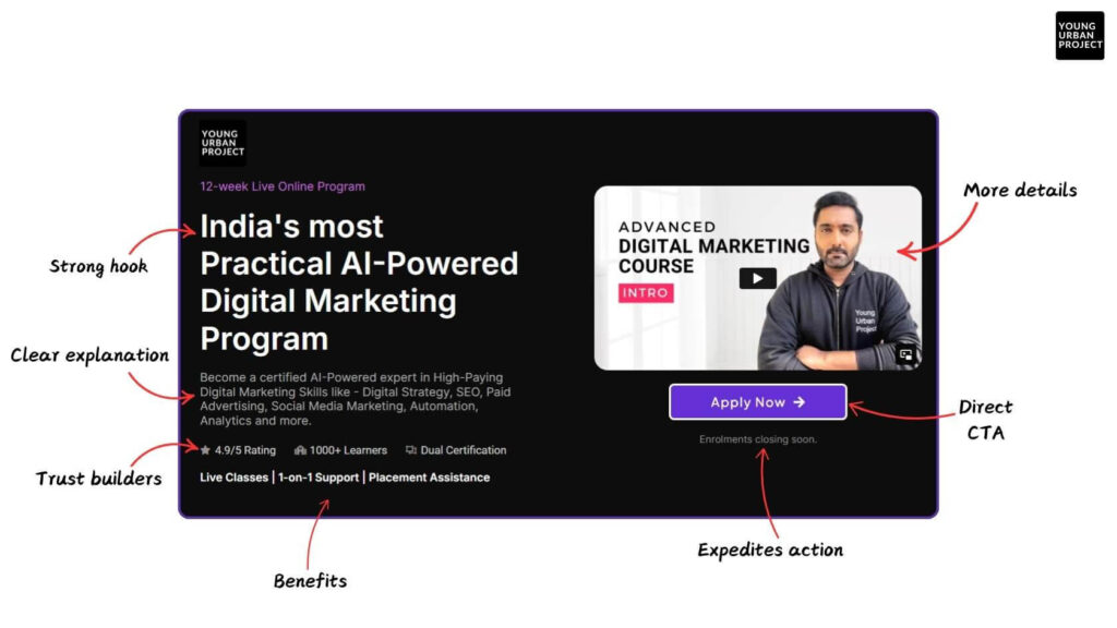
Here’s an example of a hero section from Young Urban Project’s website 👇
Why Should You Use a Hero Image on Your Website?
A hero image is more than just a decorative element; it’s a powerful tool to:
- Create an Immediate Emotional Connection: A visually striking image can evoke emotions that align with your brand’s values.
- Highlight Your Brand’s Personality: The hero image sets the tone for your website, showcasing your brand identity.
- Drive User Engagement: By making a strong first impression, the hero image encourages visitors to explore further.
- Convey Your Message Quickly: A well-chosen image can communicate complex ideas or emotions instantly, reducing the need for lengthy explanations.
Tips to Create Hero Images
Creating impactful hero images requires a mix of strategy and creativity. Here are some tips:
1. Choose High-Quality Images
Blurry or pixelated images can harm your credibility. Opt for sharp, professional visuals that capture attention.
2. Keep It Relevant
Ensure your visuals align with your brand’s message and target audience. Irrelevant images can confuse visitors and detract from your message.
3. Incorporate Text Wisely
Add text overlays that complement the image without overpowering it. Use contrasting colors to ensure readability.
4. Use Real People
Images of real people help build trust and make your brand relatable. Authenticity resonates with users, increasing engagement. Do ensure that the photos of people you are using should represent your buyer persona (in the way they look).
5. Experiment with Video
Videos can make your hero section dynamic and engaging. They are especially effective for storytelling and showcasing products or services.
6. Keep It Simple
Avoid overloading the hero image with too many elements. A clean design is more likely to leave a positive impression.
7. Test Different Designs
Experiment with various layouts, colors, and formats to see what works best. Use A/B testing to determine the most effective design. Tools like VWO can help with this.
8. Mind the Loading Time
Optimize images and videos to ensure fast loading times. A slow website can deter visitors and harm your SEO rankings.
9. Stay On-Brand
Ensure your hero images reflect your brand’s identity and values. Consistency in design helps build trust and recognition.
Examples of Effective Hero Sections
1. Figma
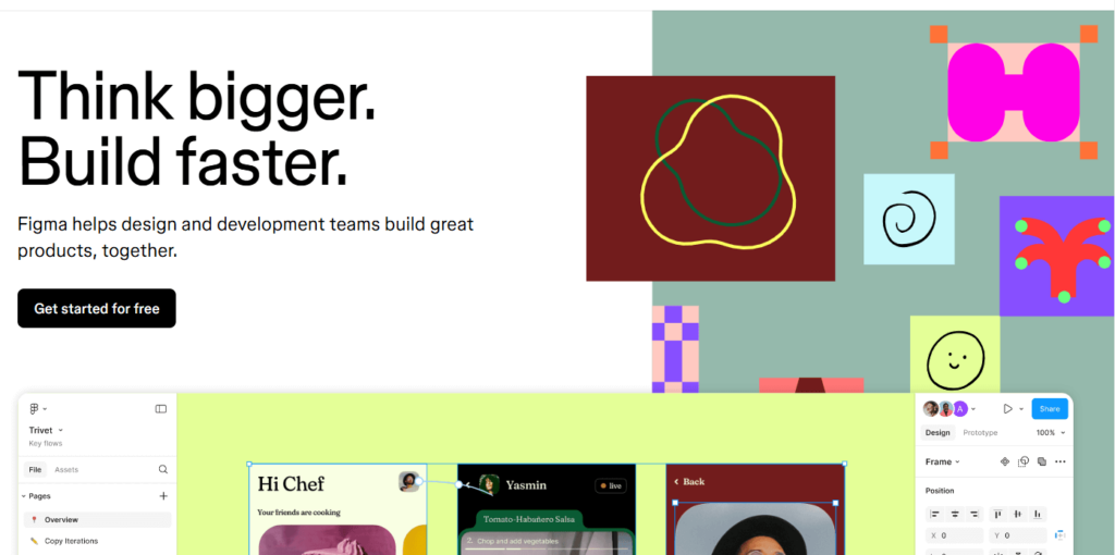
Heading: “Think bigger. Build faster.” Supporting text: Figma helps design and development teams build great products, together.” Why it works: It’s benefit-driven, clear, and user-focused.
2. Notion
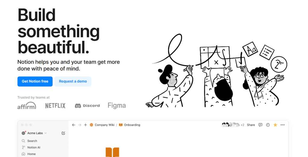
CTA: “Get Notion Free.”
Why it works: It’s action-oriented and reduces risk.
3. Slack
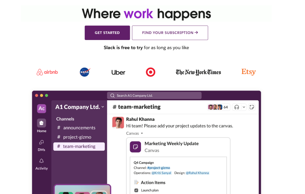
Visual: An animation showing team collaboration in action.
Why it works: It shows value without saying a word.
Also Read: Scope of Marketing: Nature, Importance, and Career Opportunities
Common Mistakes to Avoid in Hero Section Design
1. Overcrowding
Too many elements can overwhelm visitors. Focus on simplicity and clarity.
2. Ignoring Mobile Optimization
Ensure your hero section is responsive and looks great on all devices. A small button might work on the desktop screen, but might be hard to tap on the mobile screen.
3. Weak CTAs
A generic or unclear CTA can reduce conversions. Use actionable language to guide users.
Examples:
Instead of “buy now”, write “Get instant access”.
Instead of “Learn more”, write “See how it can help you”
4. Neglecting SEO
Optimize your hero section’s text and images for search engines. Use alt text for images and include keywords in your headlines. Now this is not as important if you are creating a hero section for a landing page (where the traffic is only coming via paid advertising). But for regular web pages, SEO can be extremely important.
Also Read: Scope of Advertising: An in-depth guide

Conclusion
The hero section is the entry-point of your website or landing page and sets the stage for the user’s experience. By incorporating the right elements, adhering to best practices, and focusing on user needs, you can design a hero section that not only captivates but converts. Whether it’s through bold headlines, engaging visuals, or strategic CTAs, the hero section is your opportunity to make a memorable first impression.
Invest time and effort into creating a hero section that truly reflects your brand and resonates with your audience.
FAQs
What is a hero section on a website?
A hero section is the prominent area at the top of a webpage that visually highlights the most important content. It often includes elements like a headline, sub-heading, hero image or video, and a call-to-action (CTA). It is an important part of a digital marketing funnel.
Why is it called a hero section?
The term “hero” is used because this section takes center stage and plays a pivotal role in grabbing the visitor’s attention and conveying the main message of the webpage.
How can I make my hero section more engaging?
To make your hero section more engaging, use high-quality visuals, craft compelling headlines, include clear CTAs, and ensure the design aligns with your brand identity. Incorporating videos and social proof can also enhance engagement.
What are the common mistakes to avoid when designing a hero section?
Avoid overcrowding the design, neglecting mobile optimization, using weak CTAs, and ignoring SEO best practices. Keep the design clean and user-focused.
Should I use a video or an image for the hero section?
It depends on your website’s purpose and audience. Videos are great for storytelling and showcasing dynamic content, while images are ideal for quick, impactful messages.
How important is the hero section for SEO?
The hero section plays a vital role in SEO by improving user engagement and dwell time. Optimize text and images with relevant keywords and include descriptive alt text for visuals.
Can I have multiple CTAs in the hero section?
While it’s possible, it’s better to focus on one primary CTA to avoid confusing the visitor. Keep additional CTAs subtle and secondary.
