Whether you’re trying to generate leads, drive sales, or increase engagement with a campaign, your landing page is where the magic happens. But what is a landing page exactly, and how can it benefit your website?
In this guide, we’ll dive deep into the concept of landing pages, how they work, their importance, and the best practices you can use to create high-converting landing pages for your business.
Table of Contents
What is a Landing Page?
A landing page is a web page specifically designed to capture a visitor’s information or prompt them to take a specific action. It’s the page a user “lands” on after clicking an ad, email link, or search engine result. Unlike regular website pages like your homepage, which typically serve to provide general information, a landing page is highly targeted. It aims to guide the visitor toward one specific goal—whether that’s filling out a contact form, signing up for a newsletter, making a purchase, or downloading an ebook.
Key Features of a Landing Page
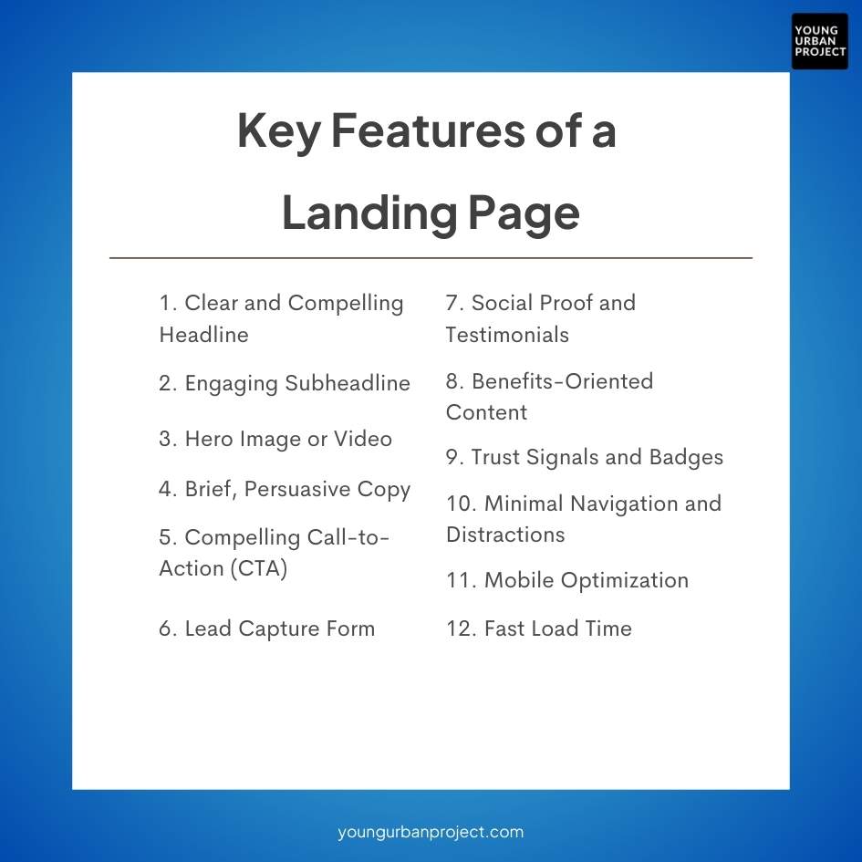
A well-designed landing page should include several key features to capture attention, engage visitors, and drive conversions. Here are the essential elements:
- Clear and Compelling Headline
A concise, benefit-focused headline grabs attention and quickly communicates what the offer is about. - Engaging Subheadline
Supports the main headline with additional information, often clarifying the value proposition or addressing pain points. - Hero Image or Video
Visuals, such as images or videos, create an emotional connection and show the product or service in action, reinforcing the offer’s value. - Brief, Persuasive Copy
Concise and benefit-oriented content explains what the visitor will gain, focusing on solving a specific problem or fulfilling a need. Bullet points or short sections help with readability. - Compelling Call-to-Action (CTA)
A prominent CTA button (or buttons) should clearly state the desired action, such as “Get Started,” “Download Now,” or “Join Today.” It should stand out visually. - Lead Capture Form
The form should be simple, asking only for essential information (e.g., name and email). Reducing friction here helps improve conversion rates. - Social Proof and Testimonials
Testimonials, case studies, reviews, or logos of well-known clients add credibility and trust, showing that others have benefited from the product or service. - Benefits-Oriented Content
Rather than focusing solely on features, emphasize the tangible benefits for the user, highlighting how the product or service improves their life or solves their problem. - Trust Signals and Badges
Security badges, money-back guarantees, certifications, or “as seen on” media logos help reduce hesitation by assuring visitors that the offer is trustworthy. - Minimal Navigation and Distractions
Keeping the navigation minimal or eliminating it entirely helps visitors focus solely on the offer without veering off to other pages. - Mobile Optimization
Ensuring the landing page is responsive and loads well on mobile devices is essential, as many users access pages via smartphones. - Fast Load Time
Slow load times can lead to a higher bounce rate, so optimizing the page for speed is crucial for keeping visitors engaged.
How Do Landing Pages Work?
A landing page is designed with a single objective in mind—converting visitors into leads or customers. To understand how landing pages work, we need to break down the process into key steps, starting from the moment a visitor lands on the page, to the actions they take afterward. In essence, landing pages are optimized to guide visitors down a path that leads directly to the desired outcome.
Below, we’ll explore how landing pages operate and why they are so effective at driving conversions.
1. Attract Targeted Visitors
- Landing pages are typically connected to a specific marketing campaign, like a Google ad, social media post, email, or other promotional effort.
- They are optimized for a particular audience, meaning visitors arriving from these campaigns already have an interest in the product, service, or offer.
2. Deliver a Focused Message
- The page provides clear, relevant information about the offer (like a product, service, or free resource) that aligns with the ad or link that brought the visitor there.
- Unlike a homepage, landing pages are focused on a single objective, eliminating distractions and guiding the visitor toward one action.
3. Engage Visitors Through Persuasive Content
- Landing pages use compelling copy, visuals, and other elements to capture attention and highlight the benefits of the offer.
- They address visitor pain points or desires, explaining how the offer will help or add value, making it easier for the visitor to see the benefit of taking action.
4. Prompt a Clear Call-to-Action (CTA)
- A CTA (e.g., “Sign Up Now,” “Download Free Guide,” “Claim Your Offer”) is prominently placed and designed to stand out.
- This CTA is often repeated in strategic places on the page, reinforcing the desired action and making it easy for visitors to convert.
5. Gather Leads or Drive Conversions
- If the goal is lead generation, the page typically includes a form for visitors to provide their contact information in exchange for something valuable, such as a discount or eBook.
- If the goal is a sale, the CTA might lead to a checkout page or cart, minimizing steps between interest and purchase.
6. Optimize and Measure Performance
- Data on conversion rates, user engagement, and behavior is collected through analytics tools.
- Insights gathered from A/B testing or analyzing visitor actions (like form completions, clicks, or time on page) allow marketers to optimize and improve the landing page over time.

Why Are Landing Pages Important?
Focused Conversion Goal
Landing pages are designed with a single, specific goal (e.g., signing up, downloading, purchasing). By limiting distractions and providing a clear call-to-action (CTA), they increase the likelihood of conversions.
Better Lead Generation
With minimal navigation and a strong focus on the offer, landing pages make it easier to capture visitor information. They are ideal for collecting leads through forms or opt-ins, providing valuable data for future marketing.
Improved Ad Relevance and ROI
Landing pages are tailored to match specific ads or campaigns, making the visitor experience more cohesive and relevant. This alignment increases ad quality scores (e.g., in Google Ads), which can lower costs and improve ROI.
Enhanced User Experience
By presenting clear, relevant information directly tied to the visitor’s intent (e.g., from an ad or email), landing pages create a smoother, more engaging user experience, leading to higher satisfaction and trust.
Data-Driven Insights
Landing pages are easy to track and analyze. By examining metrics such as conversion rates, bounce rates, and user behavior, marketers gain insights into what works and what doesn’t, enabling data-driven optimization.
Builds Brand Credibility and Trust
A well-designed landing page with social proof, testimonials, and trust signals reassures visitors, making them more likely to trust the brand and convert.
Supports Targeted Marketing Efforts
Different landing pages can be created for different audience segments, allowing marketers to deliver tailored messaging, offers, and CTAs that appeal to each specific group.
Encourages Experimentation and Optimization
Landing pages make it easy to run A/B tests on headlines, CTAs, images, and other elements, which helps identify the most effective approaches and improve conversion rates over time.
Also read: 7 Reasons Why You Need a Landing Page
Different Types of Landing Pages
Different types of landing pages serve specific purposes and are designed to drive particular actions. Here are some common types:
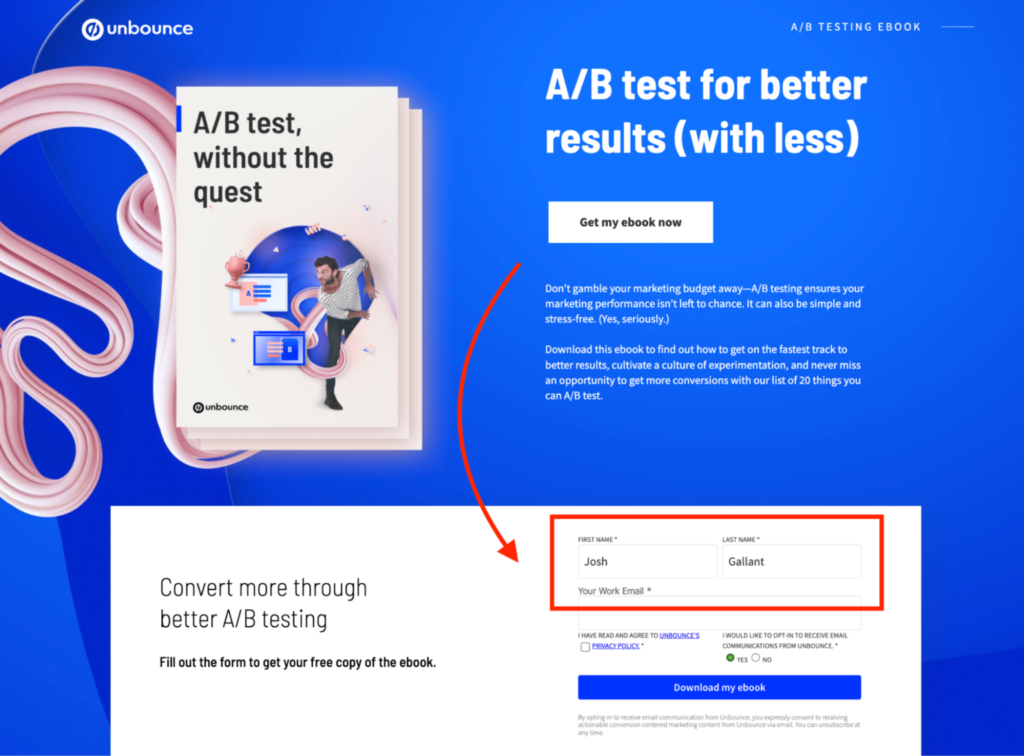
1. Lead Capture (or Squeeze) Page
Designed to collect visitor information, such as email addresses, in exchange for an offer (e.g., eBook, newsletter subscription, webinar). Lead capture pages typically have minimal distractions to keep the focus on the form submission.
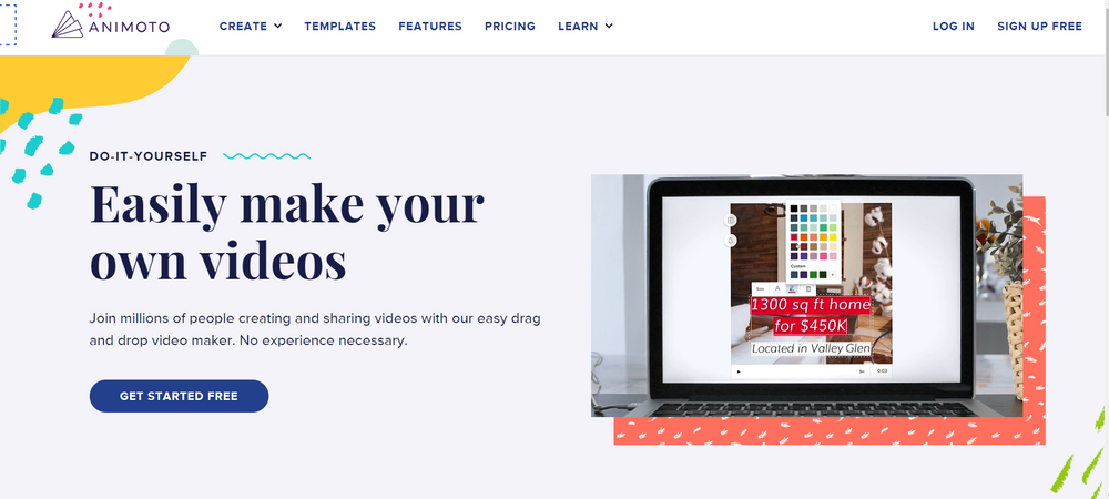
2. Click-Through Landing Page
Used primarily in eCommerce or product promotions, this page provides details about a product or service and has a CTA button leading to a transaction page, such as “Shop Now” or “Add to Cart.” There is often no form—just a CTA to encourage the next step.
3. Sales Page
A long-form landing page that provides in-depth information to guide a visitor through the decision-making process, addressing pain points, benefits, testimonials, and often ending with a strong CTA. This page aims to convert visitors directly into buyers.
4. Thank You Page
Appears after a user completes a desired action, such as a purchase or form submission. It confirms the transaction, often offering additional resources, related products, or upsell options. It also serves as a final opportunity to continue engaging the user.
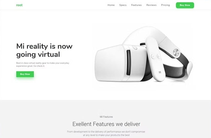
5. Product Details Page
A landing page specific to one product, focusing on showcasing its features, benefits, specifications, and often reviews. The CTA usually involves adding the item to a cart or making a purchase.
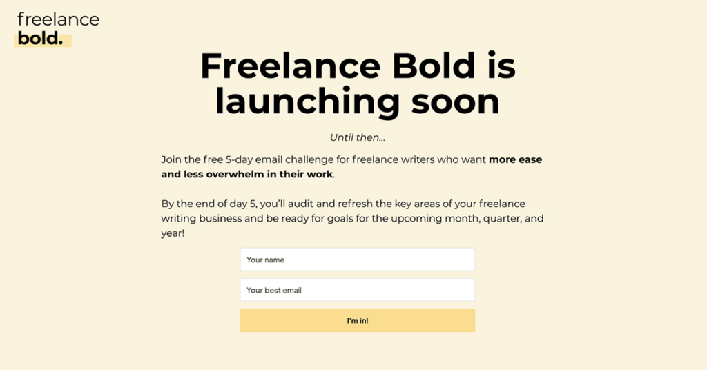
6. Coming Soon (or Pre-Launch) Page
Created to build anticipation for an upcoming product or event. It may include a signup form for notifications or an invitation to join a waitlist. This page helps generate early interest and gather leads for future marketing efforts.
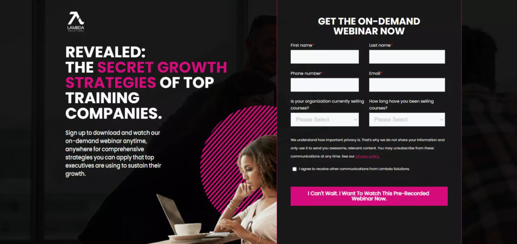
7. Webinar Landing Page
Designed specifically to promote a webinar and capture registrations. It provides details about the event, speaker information, and benefits of attending. The form is generally straightforward, asking for minimal information.
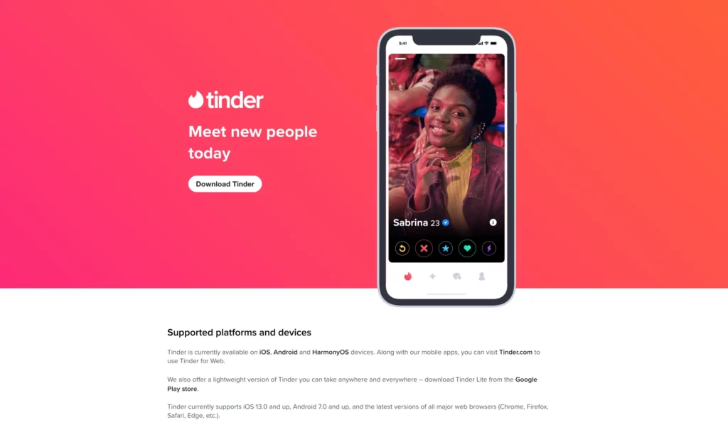
9. App Download Page
Used by mobile apps or software companies to drive downloads. It usually features compelling app benefits, user reviews, and CTA buttons that link directly to the App Store or Google Play for easy access.
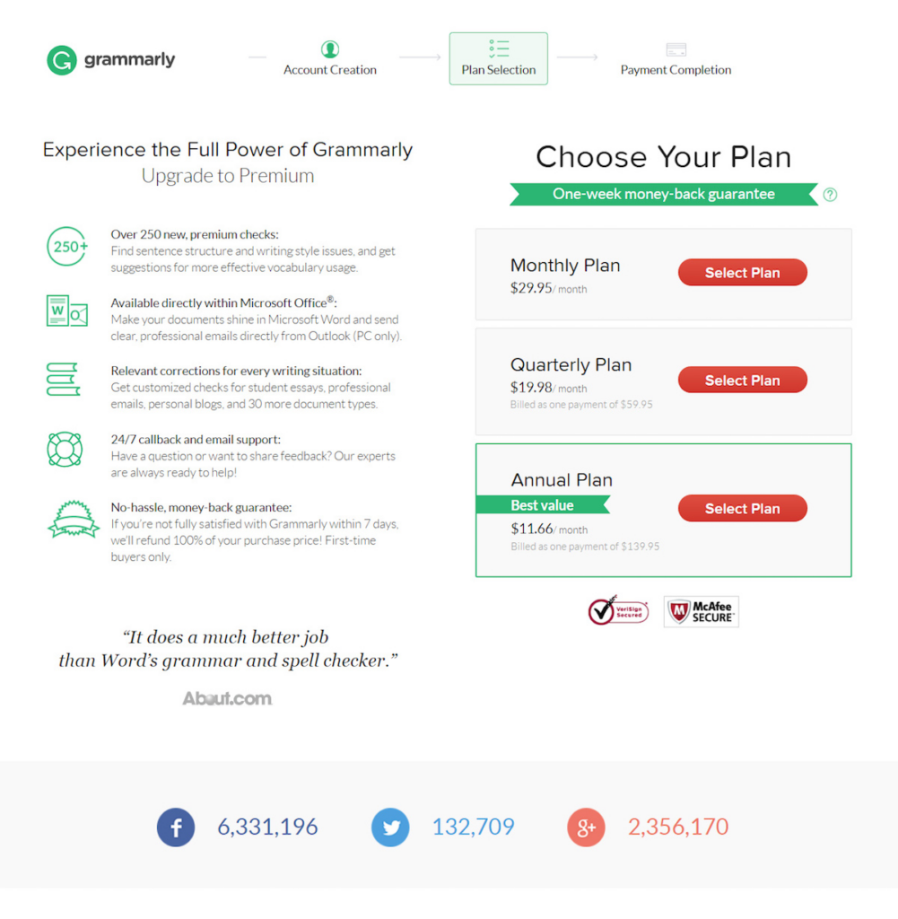
10. Upsell or Cross-Sell Page
Typically shown to customers immediately after they make a purchase, this page offers an additional, related product at a discounted price, encouraging more purchases.
Landing Page vs Homepage
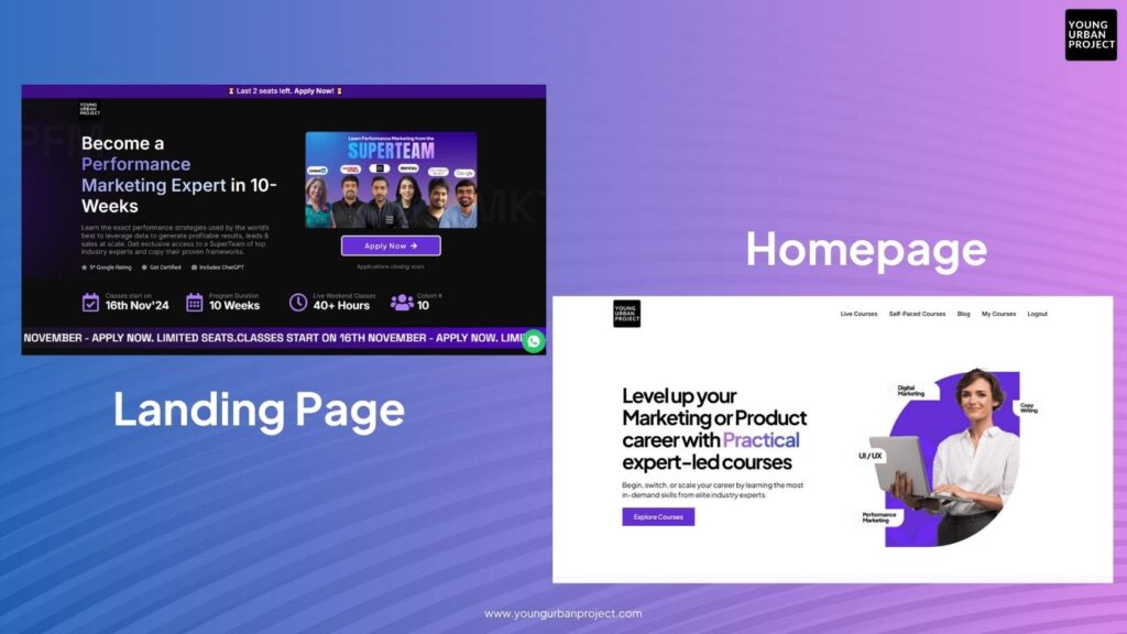
| Feature | Landing Page | Homepage |
| Primary Goal | Conversion-focused (lead generation, sales, etc.) | Informational, branding, navigation |
| Design | Simple, focused design with minimal distractions | Complex, with multiple sections and navigation |
| Content | Direct and to the point, often with one call-to-action | Broad, covering many aspects of the business |
| Navigation | Minimal or no navigation links to avoid distractions | A full navigation bar linking to other pages |
| Target Audience | Specific to a campaign or offer | General audience, targeting anyone visiting the site |
| Call-to-Action | One focused CTA | Multiple CTAs for different purposes |
| Example | A page for downloading a guide or signing up for a webinar | A company’s main page, offering services, products, blog links |
Landing Page vs Website
| Feature | Landing Page | Website |
| Purpose | Focused on achieving one specific conversion goal (e.g., lead gen, sales) | To provide comprehensive information about your business |
| User Experience | Optimised for a seamless, single-focus experience | Offers various types of content and navigation paths. |
| Structure | Single page, minimal navigation, and content | Multiple pages, with full navigation and links to other sections. |
| Conversion Goal | Conversion-centric (form submission, purchase, etc.) | Can involve multiple conversion points (contact forms, sign-ups, etc.) |
| Traffic Source | Targeted, often from specific marketing campaigns | Optimized for a seamless, single-focus experience |
How to Create a High-Converting Landing Page?
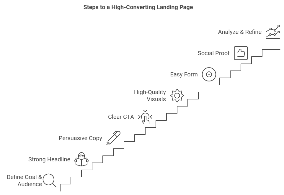
1. Define Your Goal and Target Audience
- Be specific about the action you want visitors to take, such as subscribing, downloading, or purchasing.
- Understand your audience’s needs and pain points so that you can address them directly. Create a user persona to keep your audience front and center as you design.
2. Craft a Strong Headline
- Make it clear, concise, and benefit-oriented. For example, instead of “Sign Up Today,” try “Double Your Leads with Our Proven Strategy.”
- Use power words or emotionally resonant language that appeals to your target audience’s desires or pain points.
3. Write Persuasive, Customer-Centric Copy
- Focus on benefits over features. Explain how your offer helps users solve a problem or fulfill a need.
- Break up text with bullet points to improve readability and emphasize key points. Use short paragraphs for better scanning.
- Use specific, action-oriented language. Instead of “Save money,” try “Save up to $500 annually!”
4. Include a Clear and Compelling CTA
- Make the CTA stand out by using a contrasting color and ensure it’s large enough to catch attention.
- Use action-driven phrases like “Get Started,” “Claim Your Free Trial,” or “Download Now” rather than generic options like “Submit.”
- Repeat the CTA multiple times on longer landing pages to ensure visitors have plenty of opportunities to convert.
5. Use High-Quality Visuals
- Choose a hero image or video that illustrates the offer and resonates emotionally with the audience.
- Keep visuals relevant—show people engaging with your product or visuals that support the benefits.
- Limit distractions by avoiding overly complex graphics or background elements that can detract from the main goal.
6. Create an Easy-to-Complete Form
- Ask only for essential information. Each additional field can decrease conversions. A name and email address are often sufficient.
- Consider multi-step forms if you need more information, as they feel less intimidating.
- Add microcopy under form fields to clarify the purpose of the information requested (e.g., “We’ll only use your email to send important updates”).
7. Add Social Proof for Credibility
- Include testimonials, customer reviews, or user-generated content to build trust.
- Add logos of recognizable clients or media outlets that have featured you, and consider adding short case studies.
- Use data points (like “10,000+ satisfied users”) to showcase popularity and success.
8. Reduce Page Load Time
- Compress images, eliminate unnecessary code, and avoid too many plugins or animations.
- Run a page speed test to ensure it loads in under 3 seconds; slow pages lose conversions.
9. Optimize for Mobile Users
- Ensure the page looks good and functions smoothly on mobile devices, as a large portion of traffic may come from mobile.
- Simplify forms, use larger buttons, and keep key information above the fold on mobile views.
10. A/B Test Key Elements
- Experiment with different headlines, CTA copy, visuals, colors, and form lengths to see which combinations work best.
- Test one element at a time for clearer results. Monitor conversion rates and other metrics to see which version performs best.
11. Add Trust Signals
- Incorporate security badges, money-back guarantees, or certifications to make visitors feel comfortable providing personal information or making a purchase.
- If applicable, include a privacy statement near the form to reassure visitors you won’t misuse their information.
12. Use a Strong, Relevant Exit Pop-Up (Optional)
- Consider an exit-intent pop-up offering an additional incentive (like a discount or freebie) to keep visitors from leaving.
- Keep the pop-up non-intrusive and directly related to your page goal, so it feels like a helpful prompt, not an interruption.
13. Analyze and Refine Your Page
- Use tools like Google Analytics, Hotjar, or Crazy Egg to track metrics like bounce rate, time on page, and conversion rate.
- Pay attention to user behavior insights like heatmaps to see which areas get the most interaction and adjust accordingly.
Best Practices for Landing Page
Creating a high-converting landing page is not just about having the right design or content—it’s about optimizing every element to align with the user’s journey and guiding them towards completing the desired action. A landing page is your best opportunity to convert visitors into leads, customers, or subscribers. To maximize its effectiveness, here are best practices that ensure your landing page performs at its highest potential.
1. Craft a Clear and Compelling Headline
The headline is the first thing visitors will see when they land on your page, and it must immediately capture their attention. A strong headline tells the visitor exactly what they will get by staying on the page, and it should match the promise or offer that brought them there.
- Be Specific: Vague headlines are less effective. Instead, provide a direct value proposition that addresses the visitor’s pain points or needs. For example, “Get Your Free SEO Report in 60 Seconds” is far more compelling than just “Free SEO Report.”
- Keep It Short and Punchy: Your headline should be easy to read and to the point. A concise headline works better because users often skim content quickly.
2. Create a Strong Call to Action (CTA)
The Call to Action (CTA) is the central element of a landing page. It’s the button or link that tells the user what to do next, and it’s essential for driving conversions. A high-converting landing page needs a CTA that stands out and encourages the visitor to take action.
- Make it Stand Out: Your CTA should be visually distinct from the rest of the page. Use contrasting colors, bold fonts, and clear language. Avoid generic terms like “Submit”—instead, use action-oriented phrases like “Get Started,” “Claim Your Offer,” or “Download Now.”
- Use Urgency or Value: Creating a sense of urgency or exclusivity can motivate users to act right away. Phrases like “Limited Time Offer” or “Only X Spots Left” can help push users toward conversion.
3. Keep the Form Simple
Forms are an essential part of many landing pages, especially for lead generation. However, long, complex forms can deter users from converting. The best practice is to only ask for the essential information required to complete the conversion action.
- Limit Fields: Only ask for what’s necessary. For instance, a free trial sign-up form may only need an email address and a password. The more fields you add, the higher the friction, and the less likely users will be to complete the form.
- Use Multi-Step Forms (if needed): If you absolutely need more information, consider breaking the form into smaller steps rather than displaying everything upfront. This reduces the perceived effort required to complete the process.
4. Focus on One Objective
The key to a successful landing page is clarity, and this means focusing on a single goal. A landing page with multiple CTAs or multiple conflicting messages can confuse visitors and result in lower conversion rates.
- Avoid Multiple Offers: While your website as a whole can promote many different offers, your landing page should focus on just one. Whether it’s signing up for a free trial, downloading an ebook, or making a purchase, keep everything else secondary.
- Simplify Choices: Make sure the visitor’s path is clear. If they’re there to download a resource, don’t confuse them with additional offers or promotions.
5. Ensure a Mobile-Optimised Experience
With mobile traffic accounting for a large portion of online visitors, having a mobile-optimized landing page is crucial for success. If your landing page doesn’t load properly or is difficult to navigate on mobile, you risk losing a significant number of potential conversions.
- Responsive Design: Ensure your landing page adjusts seamlessly to different screen sizes. Elements like images, text, and forms should resize appropriately, and CTAs should be easy to click on mobile devices.
- Quick Load Time: Mobile users are less patient with slow-loading pages. Aim for your landing page to load in under 3 seconds. Compress images and optimize scripts to speed up the process.
6. Use Trust Signals and Social Proof
Trust is a major factor in converting visitors into leads or customers. Visitors are more likely to convert if they feel confident in the legitimacy and reliability of your brand. Trust signals are elements that build this confidence.
- Customer Testimonials and Reviews: Displaying positive feedback from satisfied customers provides social proof that your product or service is valuable. Authentic testimonials or case studies can help overcome scepticism.
- Security Badges: If you’re asking for sensitive information like credit card details, include security badges (e.g., SSL certification) to reassure users that their data is protected.
- Brand Logos: Display logos of well-known companies or clients that use your product to build credibility. This shows that trusted brands have chosen your service, encouraging users to trust you as well.
7. A/B Test for Continuous Improvement
Even the best-designed landing pages can be improved over time. A/B testing (split testing) allows you to experiment with different versions of your landing page to determine which elements perform best.
- Test Headlines: Try different variations of your headline to see which one resonates most with your audience.
- Test CTAs: Experiment with different wording, colors, and placements of your CTA to see which one gets the most clicks.
- Test Design Layouts: Test different visual layouts to see which design maximizes user engagement and conversions.
8. Leverage Visuals to Enhance Your Message
High-quality visuals play an important role in landing pages because they help support the message and engage the visitor. Strong visuals can make your offer more appealing and explain complex concepts clearly.
- Use Relevant Images: Choose images that are aligned with your offer. If you’re offering a product, include clear product images. If you’re promoting a service, use images of happy customers or people using the service.
- Include Explainer Videos: Videos are especially powerful for explaining how a product or service works. They can provide a concise and engaging way to demonstrate your offer’s value.
9. Maintain Consistency Between Ads and Landing Page
If a visitor is arriving at your landing page from an advertisement, it’s essential that the message, look, and feel of the ad align with the landing page. This consistency builds trust and reduces confusion.
- Keep Messaging Aligned: Ensure that the offer or promise made in the ad is clearly reflected on the landing page. If your ad promotes a 20% discount, the landing page should prominently display that offer.
- Match Design and Branding: The overall design and colors of the ad should be consistent with the landing page to create a seamless experience for the user.
10. Monitor Analytics and Optimise
Once your landing page is live, it’s essential to continuously monitor its performance through analytics tools such as Google Analytics, Hotjar, or your landing page platform’s built-in tracking features.
- Track Key Metrics: Monitor conversion rates, bounce rates, exit rates, and the performance of specific CTAs. These metrics will tell you where improvements are needed.
- Iterate and Improve: Use the data from your analytics to make informed decisions about adjustments to your landing page. Continuous optimization will help you achieve better results over time.
Examples of High-Converting Landing Pages
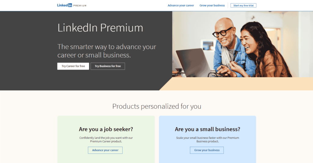
1. LinkedIn Landing Page
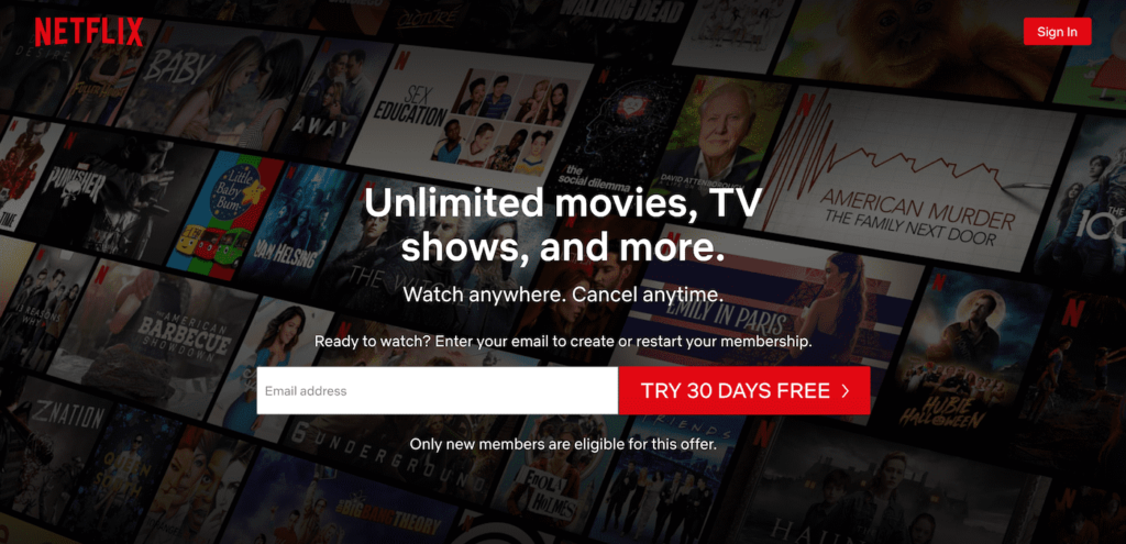
2. Netflix
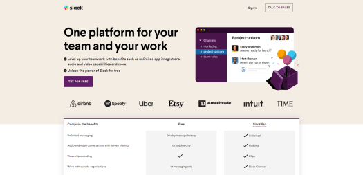
3. Slack
FAQs: What is a Landing Page?
Q1: What makes a landing page different from a homepage?
A landing page focuses on one specific goal or action, while a homepage serves as an entry point for your entire website with multiple navigation options.
Q2: How long should a landing page be?
A landing page should be as long as necessary to convey the value of your offer and convince visitors to take action. Some landing pages may be short and concise, while others (especially sales pages) may be longer and more detailed.
Q3: Can I create a landing page without a website?
Yes, you can use platforms like Unbounce, Leadpages, or Instapage to create landing pages independently of a full website.
Q4: How do I track the performance of my landing page?
Use analytics tools like Google Analytics to track key metrics like bounce rate, conversion rate, and average time on page. This will help you understand how well your landing page is performing and identify areas for improvement.

